The short story
Lead research, visual design, and UX design for Recharge’s first in-app home page.
Made key strategy recommendations that changed the focus and scope of the project.
Created new visual design elements that are now being used throughout the app.
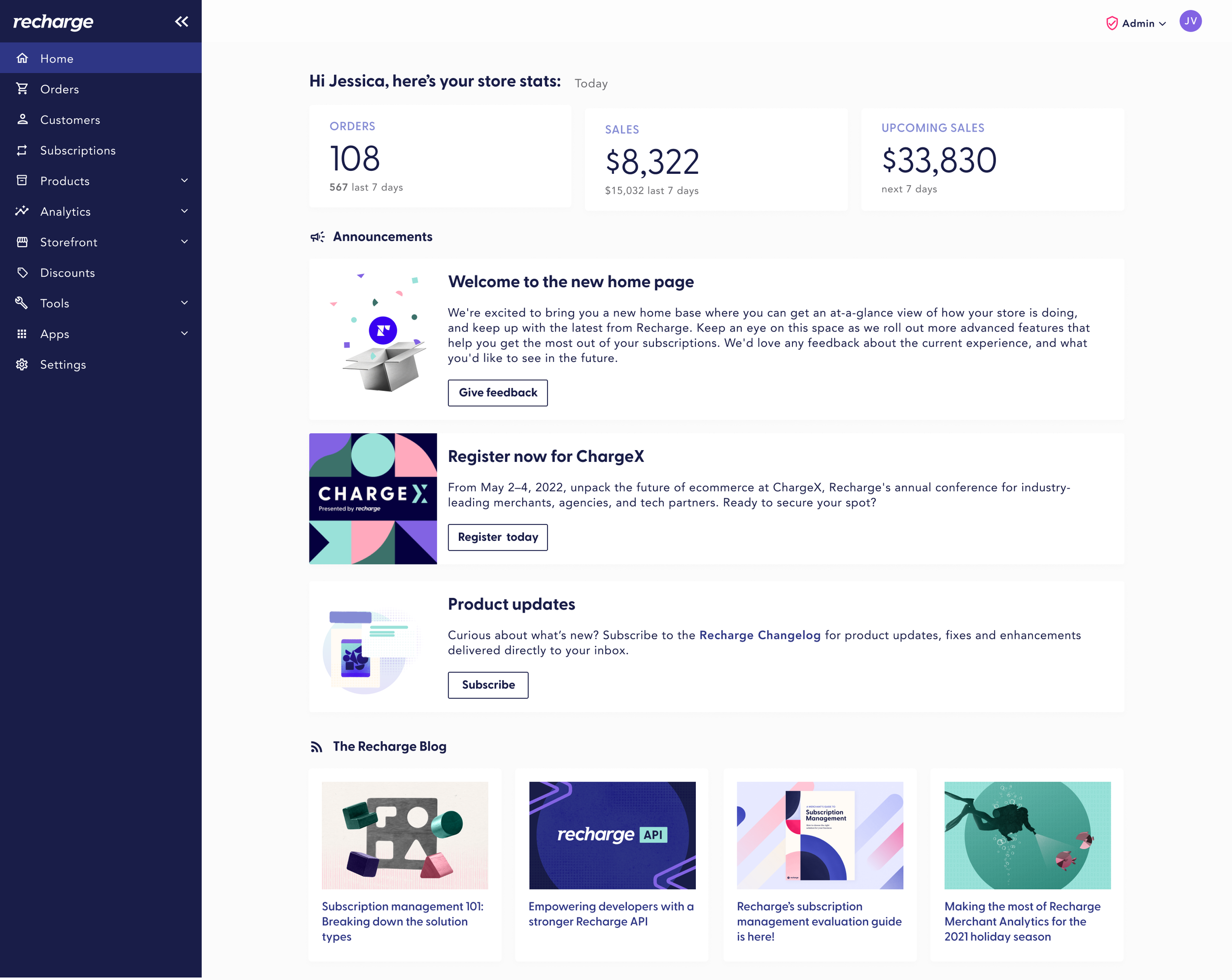
The V1 version of the home page
Background: Guiding the way
Initially, the goal of this project was to create a dashboard for merchants. During discovery, I conducted user interviews and reviewed an internal survey conducted by my fellow designer, Kayla Sawtelle. After reviewing the research and considering Recharge’s strategy, I advocated that our true need was a home page that had dashboard elements rather than a strict dashboard. Prior to the home page, users would be dropped onto a list view of their orders upon logging in. This was not the most relevant content to most Recharge’s users, and had a very unpolished feel. A home page would give a clear starting point for all users, and elevate the overall feel of the app.
This project was worked on concurrently with breaking the Recharge app out of the Shopify iframe and moving from a top nav to a side nav, so there were many moving parts to juggle.

Internal survey results and slide that helped inform strategy. Survey and presentation by my fellow designer, Kayla Sawtelle.
Conceptualization, or “What is really important here?”
A core part of Recharge’s strategy is our position as an expert on subscription e-commerce. By using Recharge, merchants don’t simply have access to a subscription payment and management platform, they have access to the experts on subscriptions as a business model. By pivoting to a home page vs. a dashboard, we can surface valuable content to existing users via an additional channel, providing further value within the Recharge product itself. This paired particularly well with launching our merchant community.
Additionally, Recharge was expanding into new product offerings for the first time, and a homepage would provide ample opportunities for cross-sells moving forward. Finally, in my conversations with merchants, it was clear that the individuals who use Recharge day in and day out consist of a wide variety of personas, and building a dashboard that would encompass their individual needs (and account for permissions) would be out of scope for the initial project.
Through user interviews, we narrowed down merchant’s core jobs to be done within Recharge. Most merchants used Shopify dashboards (or custom dashboards) for their in-depth business metrics, but welcomed the idea of having an at-a-glance view of their subscription business. Charge errors were by far the most cited problem facing merchants, and many merchants would come to Recharge to try to resolve those issues and save that revenue. (Charge errors could be the result of outdated payment data, out of stock items, among other issues.) Finally, we created announcement and blog sections to surface the content that many merchants view as valuable in growing their subscription business.
I also conducted a competitive analysis of direct competitors, partners (such as Shopify and BigCommerce), and best-in-class homepage experiences.
We wanted to create a scalable, flexible homepage that could be added to over time. With that in mind, all components were designed to span one column. I was able to create visual interest and avoid a strict timeline look by using multiple columns within individual components with reliable content – for example, using four columns in the blog section, since we could guarantee there will always be four blogs to surface, as opposed to say, the announcements section, where the announcements may vary.

An early concept. I do still like the idea of surfacing a potential lost sales number, but data constraints shelved that idea.
Outcomes: Users have a home, but there’s room to grow
At the time of launch, Recharge did not have an analytics architecture in place. While I would have loved to track user flow and determine how users interacted with the home page without relying on anecdotal data, that data wasn’t available. As such, we conducted user interviews to ascertain the overall user sentiment around the home page.
Most users feel the home page elevates the feel of the app, making Recharge appear to be a more professional, polished application. Users were excited about the potential of the home page, and quick to give suggestions regarding which data they would find more valuable, and how they would like to be able to customize the home page both on a company and a user level. In order to provide further value via the homepage, there is a great deal of work that would need to be prioritized around data and permissions structures, which has not been able to be prioritized on the road map to date.
Should I get the opportunity to iterate on this work, I’d love to have the opportunity to do so with both quantitative and qualitative data driving the project. I would like to have a firm understanding of how the dashboard is being used and its shortcomings via quantitative methodologies, and revisit the homepage with a goal of driving specific metrics. I would like to have the opportunity to conduct more qualitative research through the lens of tools like user personas and user journeys, in order to identify the level of customization needed for the home page to provide more value.
A possible future state – adding more sections, more robust stats (conceptual, there’s a lot of UX to be fleshed out there yet), and time filters.
Design impact: How the home page is shaping Recharge’s design
Our existing design system didn’t cover many of the use cases in the dashboard, so I lead visual design on multiple components. The dashboard work led to discussions and changes around our typography, and a new overline style as well as new headers outside of cards. This design also introduced the concept of using more iconography to create personality and visual interest on pages that have multiple sections. These visual design elements have gone on to inform redesigns of many critical areas of our app.